


If you are a business owner and you are looking to increase conversion rates on your website, a good place to start is to focus on your calls to action (CTAs). Conversions aren’t a given just because someone visits your website, so it’s important to understand how to properly use a CTA that is attention-grabbing and encourages your customers to follow through.
In this blog, we’ll discuss ten example CTAs for websites that work. Read on to discover how an effective call to action can lead to better conversion rates so you can start seeing enhanced lead generation and higher sales outcomes at the checkout.
What are CTAs used for on websites?
Every business needs a clear and compelling call to action on its website. Put simply, a call to action is a strategically placed prompt to encourage customers to move towards an end goal. You may want to sell a product, invite people to subscribe, gather information on a form, or share information that helps place you as a thought leader in your industry.
If there are no obvious calls to action on your website, your customer may struggle to navigate towards the endpoint that you have in mind. CTAs are crucial to capitalise on the opportunities presented when a customer visits your site.
While calls to action are an essential element of a successful conversion rate optimisation strategy, every business is different and will have unique goals which require targeted strategies and tailored CTAs for their website. This might speak to tone of voice, colour, format, image choices or button placement, and it will dictate the level of urgency you add to your button label.
5 CTA Formats
1. Hit The Button
Why they work and how to use them.
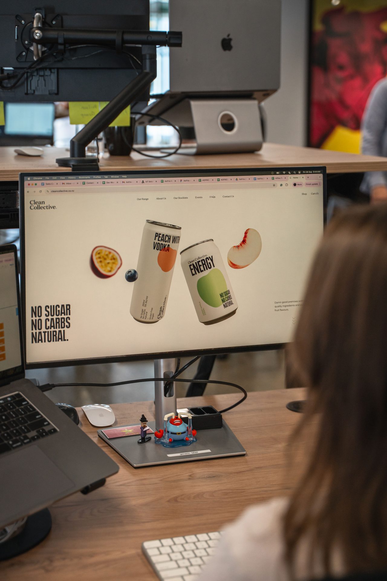
Buttons are the most popular and common types of call to action on websites. The format usually consists of a box with concise text that prompts the customer to “Buy Now”, “Add to Cart”, or other action-driven phrases. Your buttons should be designed to visually stand out with attention-grabbing, vibrant colours that adhere to your brand palette so that your customers can find them easily and follow through with a purchase or action.
Buttons should be placed strategically on your website to account for the lead temperature of your visitors. While some websites may get good results with a “Buy Now” button in the header, oftentimes the potential customer will require a softer approach, where more information is provided with a “Learn More” style prompt that leads them gently towards a more urgent prompt.
2. Forms
Why they work and how to use them.
Form prompts are used to encourage customers to fill out their contact details in exchange for a call back, information, newsletters, or other resources that you provide. Forms are a great tool for collecting leads and engaging with customers. To increase the chances of customers completing forms, they should be kept short with minimal questions. You can use “Book a Free Consultation”, or “Get a Free Quote Now” to gather some contact details and to discover what your customer is looking for specifically.
3. Banners
Why they work and how to use them.
These are much larger in size and are often presented as a graphic with engaging headlines and copy designed to attract attention. Your website design team can place CTA banners above the fold for maximum impact and visibility and on landing or product pages with eye-catching visuals and bold colours. These are effective when you need a call to action to promote a sale, discount or launch of a new product on your website. Common prompts include “Try Now”, “Sign Up” or “Get a Free Sample”.
4. Hyperlinks
Why they work and how to use them.
Hyperlinks, or contextual links, are an effective way to direct customers to another page on your website and should be included as a short line or sentence in your content that prompts an action. Adding a hyperlink CTA to your content by using clear, descriptive, natural language will ensure it blends in seamlessly with your copy and can increase drive click-through rates to your desired page. Common prompts include “click here to learn more” and so on. These types of calls to action are effective in blog posts or product descriptions.
5. Pop-Up Animations
Why they work and how to use them.
Another great way of elevating your calls to action and showcasing your brand personality is to use pop-up animations. These are effective for providing customers with an engaging experience when they are scrolling through your website. Your website design team can place animated pop-ups to enhance visibility, which is helpful if you want to direct more customers to special offers for a limited time. It’s important to ensure that these pop-ups are seamlessly integrated into your website and provide a positive user experience for your customers. Less is definitely more when it comes to pop-ups.
Visibility & Placement is Key
Take a look at your current website. Are your calls to action easy to find? They should be nearly impossible to miss and should reflect a value proposition that clearly communicates what your customer will receive from immediately engaging. They should be either placed above the fold, grabbing customers’ attention before they scroll through, or on a sticky sidebar that remains in a fixed position. It’s a good idea to add your CTAs on a conversion-focused page, such as the Home page or products and services pages.
If you are struggling to convert your browsers into buyers, website designers can create and seamlessly integrate CTAs that are tailored to complement your brand colours, tone, and the overall appearance of your site. Remember, your calls to action should offer a clear benefit and navigate straight to the access point for that benefit.
Drive conversions with 10 CTAs for websites
When designing calls to action for your website, remember that they should be placed strategically, and they need to be short, around 5-7 words maximum.
Here are examples of the different CTA themes which you might use according to your requirements:
1. Informational
These CTAs are used to encourage customers to engage and discover more information about an idea, campaign, service or product. These could be “Learn More”, “Read our Blog”, or “Download our Catalogue”.
2. Sales
Sales CTAs should be snappy, urgent, and provide instant gratification. Be sure that your sales CTAs send your customers straight to a product that can be instantly added to a cart. If you prompt someone to “Buy Now”, you need to follow through. Too many clicks leads to higher bounce rates.
3. Engagement
Encouraging your customer to engage can work like a trail of breadcrumbs to your point of sale, subscriber portal, or lead-generating form. For example, you could entice them with a few lines of clever marketing text with “Find Out More” or “Follow Us” prompts.
4. Lead Generation
These are used when your goal is to convert customers visiting your website into leads, to increase sales, and improve traffic. By engaging with this type of CTA, your customers will receive an incentive that you are offering. These might be prompts like “Download Now” or “Get Started Today”.
5. Conversion-Ready
A conversion-ready CTA helps facilitate action for customers who are ready to engage with your services. These could be “Contact Us” or “Request a Consultation”.
6. Urgency-Driven
These CTAs are effective for generating leads and can be placed on the Home page or landing pages when you want to create a sense of excitement for customers to take action right away. For example, “Sign up Today – Only 3 Slots Left!”.
7. Value-Oriented
This offers something in exchange for participating or scrolling through your website. These are effective for use in blogs, resource pages or pop-ups, and they provide a targeted solution that meets a specific need. These could be “Download Your Free Guide” or “Get A Free Trial Today”.
8. Social
These CTAs are perfect to use on your website if you offer memberships or subscriptions and want to emphasise the benefits and perks of your customers with the services you deliver. For example, “Join our growing community of 150+ people” communicates trust, as it relays that many others already benefit from your services.
9. Action-Oriented
These encourage your customers to take action by participating in a limited-time sale you are running or might offer free shipping with purchases over a certain amount. These are effective in banners or product pages on eCommerce websites and should be concise so customers understand exactly what the offer is. For example, “Buy one get one free” or “10% off – Limited time only!”.
10. Information-Led
This leads your customers to discover more information when they are reading about your products or services. These are useful when customers are in the early stages of researching and gathering insights and can be placed within product descriptions, blogs or service pages encouraging them to read more about your offerings. These include, “Discover three benefits”, or “Read about the advantages”.
Mistakes to avoid
You want to make sure that your website is using the right type of CTA, it must be tailored to your audience. Avoid adding a call to action that is only there for the sake of having one. If you’re not using the right prompt or you are placing it in a random position on your website, it will be unlikely to produce good conversion rates.
Here are a few common mistakes you should avoid on your website:
- Using boring or off brand colours for banners or buttons
- Putting buttons in positions where they are hard to find
- Too many calls to action
- Unclear prompts
- Calls to action that don’t produce instant gratification
Ready to generate more leads and sales?
Make your website work harder for you with clear, relevant, visible CTAs that drive conversion rates. If you need a new website with compelling calls to action, or your current website needs a revamp to capture your customer’s attention, The Web Guys can help.
It’s time to partner with a forward-thinking website design and development team that knows exactly how to grow your business. Contact us today to get a free website audit, or start a conversation now about innovative ways your business can convert browsers into buyers.