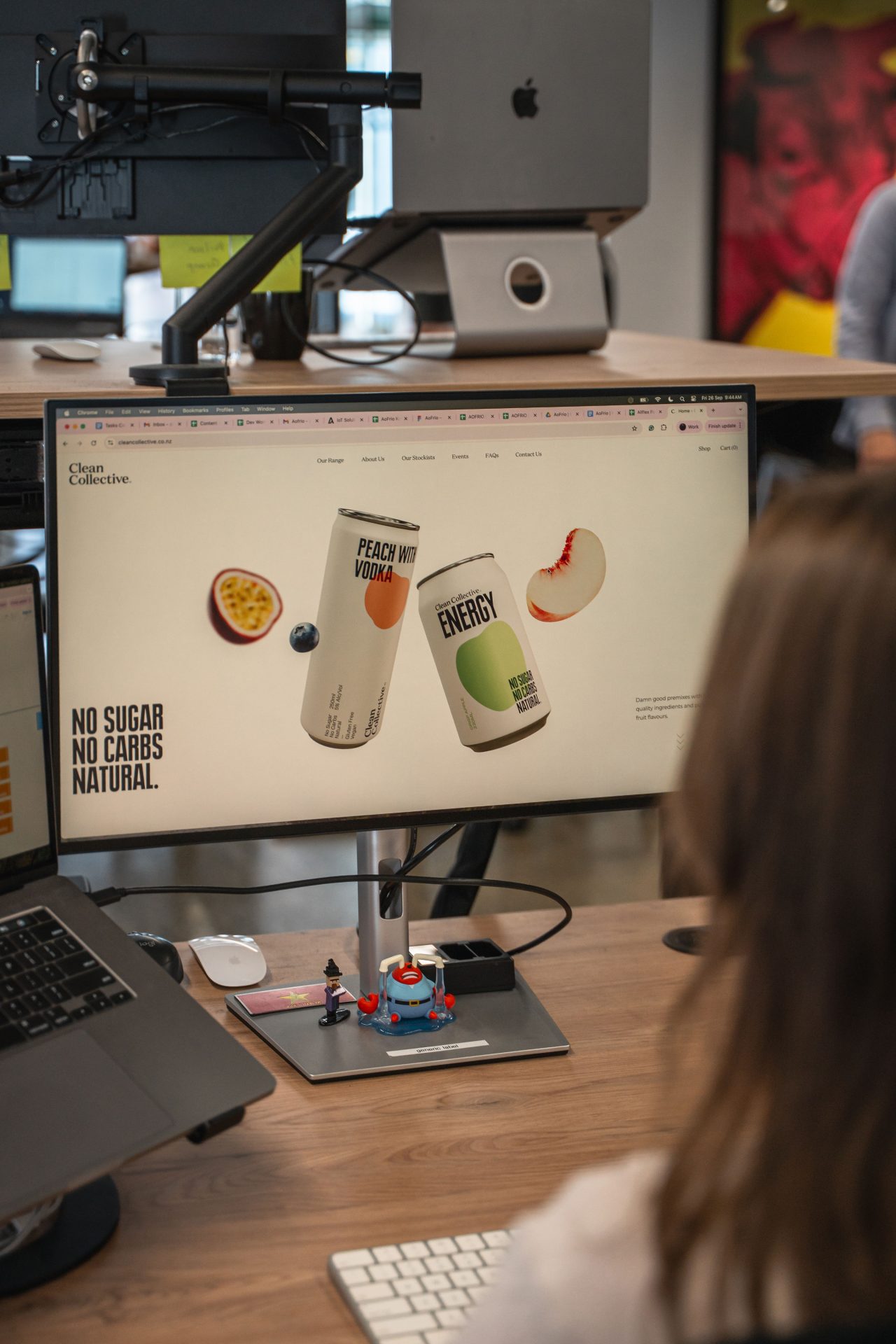
If you are looking for a website design for your business, you will likely be thinking about the websites that have caught your eye as you go about your day. In the last decade, the massive explosion of online shopping, information sharing and our constant search for reviews and comparisons of products and services means that we have multiple daily interactions with a wide variety of websites.
As consumers and business people, we are becoming more tech and design-savvy all the time. We know what we like—and what we find draining—when we hit the browser for some gratification. While you may not have a technical understanding of what functions and capabilities work best when it comes to User Experience (UX), you will probably have noted that one of the most impactful considerations from your own experience is whether the site you are visiting is a website designed for desktop that translates seamlessly to a website design for mobile.
So, how do we design a website for mobile and desktop that can deliver excellence under a broad range of conditions? Would you like to better understand the features integral to UX design that serve the user across a range of devices? What are the elements integral to mobile friendly websites?
Read on as we explore User Behaviour, Touch vs Click, Fluid Grids, CSS Media Queries and a variety of other important factors that come into play when we approach desktop vs mobile UX design. Here, you will discover some best practices and key differences that can spell the difference between success and failure for your commercial enterprise.
Why Mobile and Desktop UX Design Differ
It’s no mystery that your website must accommodate both mobile and desktop users. A responsive, adaptive design that prioritises user flow with smart layouts and attention to best practices in terms of padding, pixels and font sizes is a non-negotiable if you want your business to present a polished digital presence.
User Behaviour Is Key
Our firm attachment to our smaller devices is now thoroughly embedded into our
culture, expectations are high, and we want to navigate the online world seamlessly and have that translate to real-world efficiencies in a split second. We may have a little more patience when using our laptop or PC when it comes to searching, finding and engaging, but when we are using our mobiles to connect with what we need, we are often on the move. This means your business needs a responsive website that meets the user as they transition between cityscapes and lighting profiles when they are walking or waiting, eating, commuting, and almost always—multitasking.
Touch vs. Click
When it comes to the different physical interactivity required for a website design for mobile and a website design for desktop, we are talking about touch versus click. This is the difference between a mouse, which can be precisely shifted to a point on the screen, with the option to hover before committing, versus a fingertip trying to connect with a button, link or form while holding a mobile phone and potentially trying to plot a safe physical course towards an end or interim point.
Responsive Website Design: Ensuring Adaptability
In simple terms, a responsive website adjusts seamlessly to the size of the screen that is being used. We have all had the experience of opening a site and being met with text and images that slide off the side of the screen, buttons that can’t be accessed and forms that shift in frustrating ways that stop you from proceeding to where you need to go. Sites that require you to zoom in, side scroll and pinch to view content that is slipping off the page deliver a substandard user experience, and this will lower your rankings.
Importance of Mobile-Friendly Websites
Recent data from 2023 reveals that mobile devices generated a whopping 58.67% of global website traffic in the last quarter of the year. This indicates that when it comes to retaining browsers and avoiding bounce, responsive website design is crucial. Google loves mobile-friendly websites, and this will be reflected in your ranking, so a focus on SEO, accessibility and user-friendly design is critical.
Key Elements of Responsive Design
In order to nail the basics of responsive design, you need to work with a team that understands best practices and what 100% streamlined website design for mobile entails in an aesthetic and technical sense. While there is a range of elements that must be present to ensure that your site is optimised for a pleasurable and satisfying user experience, these three items should be fundamental to your design.
Fluid Grids: Your grids must be fluid rather than working to predetermined column sizes. Your website designer must be able to utilise relative units like percentages to facilitate proportional shifts that maintain the integrity of the design as the user shifts between different size screens.
Flexible Images: Aesthetics are important to you and your customers. The images on your website must resize seamlessly according to where your site is opened without a reduction in quality.
CSS Media Queries: Your website designer must be able to use code to target viewport width and height, the orientation and resolution of your on screen elements and features like correct aspect ratio so they will respond correctly across a range of media types.
Vital Differences Between UX Desktop & Mobile Design
A professional website design team will understand how to address navigation, content layout, and interactivity design and maximise your load times and performance stats to create mobile-friendly websites that also shine on the desktop.
Navigation for a mobile-friendly website will be minimal, thumb-friendly, and will likely utilise a hamburger menu style. Desktop website design can accommodate a more extensive approach with horizontal drop-down menus.
Content Layout for mobile must allow fast access to essential information and should offer a single-column view, whereas your desktop can include multiple columns and sidebars.
Interaction Design for mobile is influenced by the requirement to tap, pinch and swipe and icons and button sizes must adhere to best practices in terms of size and appearance. Desktop design can play with drag-and-drop features, and hover effects should be designed with clicks as the primary interactive action.
Load Times and Performance are vital to a streamlined user experience, and your mobile-friendly website must prioritise faster loading with smaller assets that recognise data restraints.
Best Practices for SEO-friendly Mobile UX Design
So, creating a responsive website designed to optimise the user experience and your website ranking will avoid complicated navigation, include easy-reach interactivity, and have large buttons for easy tapping. The content should be distilled, clean, and focused and should lay out essential information in the first couple of paragraphs to avoid browser bounce. While pop-ups are a useful desktop tool, your mobile site design should keep these minimal as they can interrupt user flow; this is especially intrusive before main page content has a chance to load, so think about utilising links in your content or footer as an alternative.
Best Practices for SEO-friendly Desktop UX Design
Larger screens allow for multi-column layouts, sidebars, and more detailed visual elements, including hero images, animated backgrounds and videos. SEO-friendly desktop design can also incorporate a broader visual hierarchy to guide the user with size, spacing and contrasting elements that feel balanced and highlight items and information in order of importance. You can also get your designer to incorporate hover functions, scroll-triggered animations and tooltip boxes to add variety and explicit guidance for browsers. The scope for additions is simply larger, and that opens up possibilities for vibrancy and interactivity.
Want to Maximise Your Potential for Success?
User experience is the holy grail when it comes to effective website design for your business, and as you can see, it is a complex and multilayered discipline that requires expert attention to pull it all together. You must provide a cohesive experience for your customers that adapts to whatever screen they are currently using in order to compete for a decent market share, and tailoring your website to target the needs of an audience that wants to be met instantly, wherever they are, is essential in a world that moves at breakneck speed.
Start a Conversation Now
At The Web Guys, we understand that your web presence translates to a digital handshake, a warm welcome and an opportunity to enhance your brand presence, so you must put your best foot forward 100% of the time.
Get in touch with our expert team today, and let’s start a conversation about the level of success that you could access with a mobile-friendly website for your business.


